Upgrade your Excel skills: A smarter way of visualizing your data in Excel
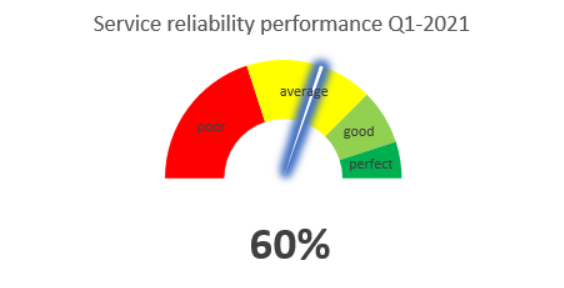
You probably can visualize your data in Excel by designing different kinds of charts and graphs, but how do you make it more effective impressive, especially like the one shown in the figure above? No need to wander anywhere else. In this blog, I am going to tell you how to create this chart called a speedometer chart (see figure 1 above), which you can use to picture the results of your data analysis.
#1: Create the secret layer
To create this speedometer, we combine two doughnut charts together, one works as a speedometer and the other one is the pointer. Open Excel and type text of the secret layer shown in figure 2. It is “secret” because you are going to hide this layer and show only the chart.
- The speedometer contains start point, low, medium, high, and end point. The start and end point are mandatory, which represent 0% and 100% respectively. The sections between those points can be named differently depending on your purpose. For example, instead of low-medium-high, you can also determine “poor-average-good-perfect”. More importantly, the sum of the start point and these sections must be equal to 100%, which is the end point. The value of these sections varies upon your needs. The values in S1 in figure 2 are an example referring to how you can determine them.
- The pointer contains value, point, and total. Value is the data you would like to show on the chart (e.g. service reliability is 10%, which is the data filled in “value” and probably lies in section “low” or “poor”). Point determines how thick the pointer (the line in the figure) is. In the figure it is 1%. Total equals to the sum of the value of start point to end point, subtracting by the sum of value and point (S1 in figure 2). In this way of setup, the pointer moves from left to right.

Figure 2. Doughnut charts
#2: Draw the speedometer
Let’s make something important here! You should follow the actions below and compare with the steps (S1, S2, S3, etc.) in figure 2 above to get things right. It does look a bit complicated, but it is super easy to understand!
- Insert a doughnut chart (S2) => Go to “Chart Tools” and then section “Design” => Choose “Select Data” => Click “Add” (S3).
- Click “speedometer” (or in the figure row A1) to fill in “Series name”. For the “Series values”, chose the value of the start point to end point (in the figure row B1-B7). Click “Enter” and a doughnut chart will appear.
- Click anywhere of the doughnut => Right-click and select “Format Data Series” (S4) => In the icon of three columns, change section “Angle of first slice” to 270 degree and section “Doughnut Hole Size” to 50-65 degree. This will change the chart to what looks like in S5.
- Double click to the down half of the doughnut (the green part of the chart in S5) => Select “Fill” in the icon of a bucket and choose “No fill”.
- Select each part of the upper half and change color (still in the “Fill” section). As seen in S6, poor is colored in red, average in yellow, good in light green and perfect in dark green. For the legend, you can change or delete it.
#3: Finalize your chart by adding a pointer
Now, let’s finish it! Again, follow the steps and compare each with figure 3.
- Click anywhere on the chart => Right-click and choose “Select Data” => Choose “Add” => Click “Pointer” (or in S2 row A9) to fill in “Series name”. For the “Series values”, chose the value of the value to total (in S2 row B10-B12). Click “Enter” and a doughnut chart will appear around the current one.
- Click anywhere on the 2nd chart => Right-click and choose “Change Series Chart Type” (S3). A pop-up will appear. Then in section “Pointer”, change the type from “Doughnut” to “Pie”. Click “Enter” or “Ok”.
- A colored circle will be displayed over the 1st one (the grey circle in S4), but no worries! Now, we’re going to do something similarly to step 2. Before that, you need to adjust the value of Point (row B11 in figure 3) from 1% to 5%. This enlarges the pointer to make it easier for the next step. When the step is complete, we will lower the point value, which makes the pointer good-looking.
- Click anywhere on a circle/ pir chart (the grey circle in S4) => Right-click and choose “Format Data Series” => In the bucket icon, change section “Angle of first slice” to 270 degree => Move to the bucket icon and choose “No fill” (S5).
- Click the small triangle at the start point (see S6). It is the pointer. Right-click, choose “Format Data Series” and enter the bucket icon => Select “Solid fill” and choose a color you think it fits (in this case, I chose blue, shown in S7).
- Test by filling in a random value. For example, I filled in 50% and the pointer (S7), if it works properly, should be the middle of the speedometer.
- Makeover time! Now you just need to make it look nicer by adding some legend for example. Don’t forget to change the size of the pointer and hide the secret layer. Have a look at S8 to get some inspiration.

Figure 3. Doughnut charts with the pointer
So it wasn’t difficult right? Practice with your own data a few times to make it your own knowledge! If you want to know another simple yet effective way to visualize your data, have a look at this blog about a stacked bar chart presenting a comparison between costs and lead time of a supply chain.
Thank you for reading and share if you think it is useful for your fellow friends!
Series Excel skills
-
Work Smart – How to automate repetitive emails?
Example of a VBA macro that automates sending repetitive Outlook emails.
-
Upgrade your Excel skills: A smarter way of visualizing your data in Excel
Visualizing data in Excel by creating charts and graphs.
-
Analyze data in Excel with a case study of Dry Port to Dry Port (Part 2)
Data analysis in Excel with a case study of Dry Port to Dry Port (Part 2)
-
Analyze data in Excel with a case study of Dry Port to Dry Port (Part 1)
Practical example on how to collect, clean and analyse data in Excel.
-
How to manage your finance effectively?
How to manage your finance effectively and how to create a Personal Balance Sheet and Personal Income Statement in an Excel worksheet.
Share this


0 Comments